Software Which Shouldn’t Ever Exist…
Today, I shall show you guys the history of software, and learn… on what not to do
Software is as confusing as it’s grimmer is. The other day I just said softwareS with an S to one of my colleges, which was enough to rage him into getting a doctorate in English and kill me.
Coming to the topic we talking about, the software market has one of the best diverse collection of software. I still remember the time when I was 10 and I though chrome is a metal which people add into their computers to use the internet. But then I realized,
Many of us are kept away from software we don’t use by the internet itself… which is obvious considering your gonna get tech related suggestions if you just watch tech related videos on YouTube.
Therefore many of us are away from less known, dumber software which existed before when Facebook was considered cool and even now. Today, we shall look at some of those software which should not exist, due it’s various reasons such as given hate, lac of usability, and even down right harmful.
Ask Toolbar
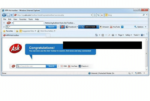
Although I was not born when this was, I still remember this UI being used by some of my older generation friends. This was soo popular, that by 2006, 62% of all Windows XP computers used this feature… or should I say virus. It’s a normal software, but pretty useless as of the modern standards. It’s basically a panel which always exists at the corner of the screen, which could be used to search on the web, and many more useless button on the panel.

The reason why this was hated was because
- It was known to be sponsored by many other famous websites, and just downloaded itself without the users consent to download and started off existing as a panel into your computer(hence a virus).
- It was fairly useless considering that this could be either added into Windows XP into the start button or just use it by opening the web browser, which is way more convenient by it’s nature. Also having this in means that the user has TWO panels on the screen, which is enough to make a difference in the screen usage efficiency.
iTunes for Windows
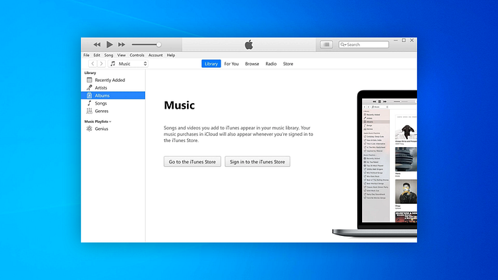
This is something nobody seems to have a problem with, but I added it myself, considering the “oldness” of this app.
This is modern and an active app provided by apple for Windows users to enjoy podcasts and voice services. This still looks like an app made during MacOS Lion era and outdated. I think it’s very clear that nobody uses this, and Apple has not even tried, but it still exists, probably to capitalize on the very niche group of people who could not afford Apple, yet are so bit fans of it, that they prefer using this crap.

I’d say if your using Windows, just use Spotify like me. You’ll get some torcher through the ads they give, which seemingly does not even match your interests, and simply spawn from nowhere, but you’d still get a better experience than iTunes on Windows.
Microsoft Works
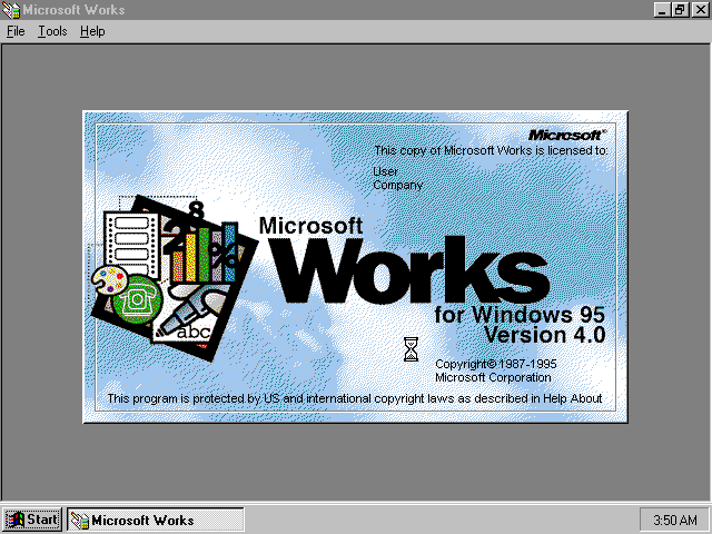
This is Microsoft office, but without the good part. It was not separated into stuff like word, excel and stuff. It was one single software, with about 5 to 10 templated of job application, etc, and other subdivisions like newsletters and flyers, home and money, events and planning, etc.
The problem with this was that it was a mess. It had all the bad features of Microsoft Office into one confusing interface, where you could navigate around and view newsletters and stuff. People obviously could not get around with this app at the time, because nobody was actually used to this kind of UI. This eventually was cancelled by Microsoft itself and was evolved into Microsoft Office, which made people learn only the stuff they need. Now, they don’t have to learnt text docs, spreadsheet management, etc all at once, because they are different applications (MS Word and Access), which they could learn if they want to.
Hypercard
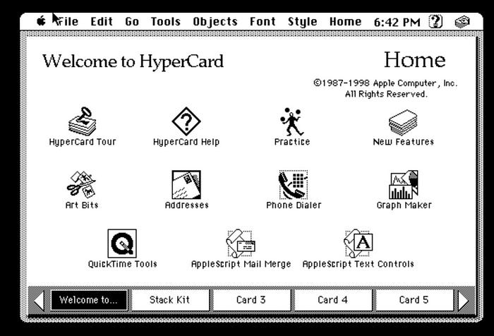
This application literally served no purpose. It was developed by Apple way back in the days after the release of Macintosh. It was developed to originally show people how User Interface works. I kind of see what Apple was trying to do with this. They were trying to set a new standards of UI, by creating an empty application, which just did nothing and showed the design of how UI should be… That’s It. Now sure… it could “educate” people on the UI… But really? I think it would be way more useful if people just used their UI rather than playing with nothing.
Now I must say… although this app was completely flop and almost nobody used it, it still gave rise to a very important software GUI element, which we call the wizard system.
Finally, Windows Vista and 8
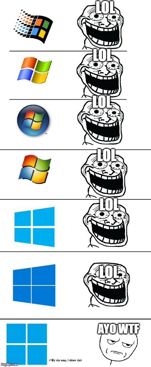
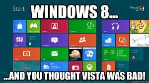
This really does not need an explanation I guess, considering I’ve made many articles in the past on this, and it’s obvious why people hated this. But to put it into a nutshell, he operating system itself consists of nothing new except bloat, more bloat and some refreshments of UI in between, when compared to it’s previous release.
Of course, all of the above info are mixed up with my personal bias and opinions on what feature I like and what I did not. For example, Microsoft Works could be a great app for some. But, it’s not for most and myself included. So, feel free opinionate yourself in the comment section, and I’ll definitely have a look and reply when possible. That’s really about it in this article. I hope you guys enjoyed this and got something from this. If you feel like donating, you could do that through Patreon, BuyMeACoffee, or just subscribe/follow on YouTube/Medium, etc. I’ll meet in you in the next one.
You’re Awesome :)
FadinGeek
